Planning a wedding requires a vision that translates from paper to reality with precision and grace. The foundational element of this vision is the color palette. It is not merely a choice of aesthetics but a strategic decision that influences every aspect of the event design. From the stationery that lands in mailboxes months in advance to the napkins on the tables at the reception, color creates a cohesive thread that ties the celebration together. Selecting the right combination of hues sets the tone before a single guest arrives. It informs the flowers, the attire, and the lighting, creating an atmosphere that resonates emotionally.
This guide serves as a comprehensive resource for navigating the complex world of wedding colors. It moves beyond simple preferences and dives into the psychology, seasonal shifts, and architectural considerations that make a palette truly successful. Whether drawn to soft pastels or dramatic jewel tones, the goal is to create a curated experience that feels intentional and personal. By understanding the rules of design and knowing when to break them, it is possible to craft a celebration that feels both timeless and entirely unique.
Why Your Wedding Color Palette is the Heart of Your Big Day
The color palette functions as the visual heartbeat of the wedding. It is the design language spoken throughout the event. When guests enter the venue, the colors surrounding them immediately communicate the formality, mood, and style of the occasion. A palette of crisp whites and silvers suggests a formal and elegant affair, while a mix of terracotta and sage implies a relaxed and organic gathering. This immediate visual cue helps guests understand how to engage with the event.
Furthermore, the palette is the most powerful tool for creating continuity. Weddings consist of many moving parts and different vendors. Florists, bakers, dressmakers, and stationers all work independently. A strong color palette acts as the central guidebook for these professionals. It ensures that the bridesmaid dresses complement the linens and that the floral arrangements do not clash with the Ultimate Guide to Wedding Invitations. Without this central anchor, the visual elements can feel disjointed and chaotic.
The Visual Anchor Effect
Think of the color palette as the brand identity for the wedding. Just as a company uses specific colors to create recognition, a wedding uses a palette to create a unified experience. This consistency in design elevates the event from a simple party to a curated and sophisticated celebration. It ensures that every photograph taken tells a consistent story, preserving the memories in a beautiful and harmonious way.
Understanding the Emotional Impact of Color Choices
Color psychology plays a significant role in event planning. Every hue evokes a specific emotional response and can subtly influence the mood of the room. Understanding these psychological underpinnings allows for a more strategic selection of colors that align with the desired atmosphere of the wedding. Blue is often associated with calmness and serenity, making it an excellent choice for events intended to feel peaceful and grounded. Red and orange, on the other hand, are high energy colors that stimulate conversation and excitement. They are ideal for evening receptions where the goal is celebration and movement.
Green has a natural restorative quality. It brings the outdoors in and creates a sense of balance and freshness. Yellow is synonymous with happiness and optimism, bringing a sense of warmth and joy to the proceedings. Neutrals like beige and gray offer sophistication and allow other elements to take center stage. When selecting a palette, consider how the colors will make the guests feel. Do we want them to feel energized and ready to dance, or relaxed and contemplative? The answer to this question lies in the science of color.
Psychological Priming
The colors chosen for a wedding prime the guests for the experience. Using soft, cool tones can slow down the perceived pace of time, making the event feel leisurely and elegant. Using warm, saturated tones can make the environment feel vibrant and energetic. Understanding this helps in tailoring the experience to match the specific vision of the day, ensuring the emotional impact matches the aesthetic one.
The New Color Philosophy: Moving Beyond Traditional Rules and Embracing Personalization
The era of rigid wedding rules has passed. Modern wedding design prioritizes personalization over tradition. Old guidelines dictating that one must match the bridesmaids dresses to the napkins exactly are no longer relevant. The new philosophy embraces depth, contrast, and personal expression. Couples are encouraged to choose colors they love rather than colors they think they are supposed to use. This shift has led to the rise of unexpected pairings and the use of multiple accent colors rather than a strict two color limit.
This approach allows for greater creativity and texture. Instead of matching everything perfectly, the focus is on coordinating tones. For example, a palette might feature a primary color of blush with varying shades of terracotta, rust, and peach as accents. This creates a layered and organic look that feels far more sophisticated than a flat, monochromatic scheme. It is about creating a mood board rather than a paint swatch list. This freedom extends to the seasons as well. While seasonal colors are a helpful guide, they are not laws. Winter weddings can feature bright citrus tones, and spring weddings can embrace moody dark hues if it suits the couples style.
The Ultimate Seasonal Color Guide
Seasonality has traditionally been the primary driver of wedding color selection. Nature provides a distinct palette during each time of year, and working with these natural cycles creates a sense of harmony and ease. However, the interpretation of seasonal colors has evolved. We are moving beyond the clichés of the past and embracing more nuanced interpretations of what it means to have a spring, summer, autumn, or winter wedding.
Spring Wedding Colors: Fresh Pastels, Lilac and Greenery
Spring is synonymous with renewal and new beginnings. The color palette for this season should reflect the freshness of the blooming landscape. While pastels have long been the standard for spring, modern interpretations are moving toward slightly more saturated versions of these soft hues. Lavender and sage are standout choices. Lavender offers a romantic and slightly whimsical feel without being overly sweet. It pairs beautifully with sage green, which adds an earthy and grounding element to the soft purple.
Consider incorporating lilac and soft butter yellows to mimic the first flowers of the season. These colors work exceptionally well in garden settings or outdoor venues where the natural light can enhance their delicacy. When planning a spring wedding, consider how these colors will interact with the fresh greenery of the surroundings. The palette should feel like an extension of the environment.
Summer Wedding Colors: Luminous Hues, Citrus Shades and Sunset Glows
Summer weddings are defined by intensity and light. The colors chosen for this season must be able to hold their own against the bright sun and long days. Luminous hues that reflect light are ideal. Citrus shades like lemon, lime, and tangerine bring a punch of energy and fun. These colors are playful and evoke the feeling of a tropical getaway or a poolside party. For a more elegant approach, sunset glows are a sophisticated choice. Think of coral, peach, and warm pink tones that mimic the sky at dusk.
Butter yellow is a particularly strong trend for summer. It is softer than a bright lemon but warmer than a cream. It brings a sense of nostalgia and sunshine to the table settings and floral arrangements. These warm tones photograph beautifully in the golden hour light that is typical of summer evenings. Using these colors creates a vibrant and inviting atmosphere that encourages celebration.
Autumn Wedding Colors: Earthy Naturals and Warm Terracotta Tones
Autumn is the season of texture and warmth. The palette should mirror the changing leaves and the harvest atmosphere. Earthy naturals are the foundation of a sophisticated autumn wedding. Mushroom beige is a versatile and chic neutral that serves as an excellent backdrop for bolder accents. It is softer than taupe and warmer than gray, providing a cozy and elegant feel.
Warm terracotta and rust tones are the stars of the season. These colors bring a richness and depth that is perfectly suited to the cooler weather. They pair exceptionally well with metallic accents like copper or gold. Dried florals and grasses in wheat and champagne tones complement this palette perfectly. The goal is to create a feeling of warmth and abundance. These colors work particularly well in barn venues or outdoor ceremonies that take advantage of the natural fall foliage.
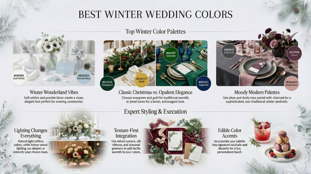
Winter Wedding Colors: Moody Jewel Tones & Dramatic Elegance
Planning a winter wedding offers a distinct opportunity to step away from the pastel palettes often associated with spring and summer. The season naturally lends itself to sophistication, depth, and drama. Selecting the right color scheme is not merely about aesthetics. It serves as the foundation for the entire event design, influencing floral choices, attire, lighting, and the overall guest experience. A well curated palette transforms a cold month into a warm and inviting celebration. This guide explores trending color families, style applications, and strategic planning to ensure a cohesive visual story.
Trending Color Families & Themes
Winter palettes have evolved significantly. Modern trends focus on rich saturation and complex undertones rather than the traditional red and green of the holidays. The goal is to create an atmosphere of intimacy and luxury. Whether the preference leans toward organic warmth or high contrast drama, understanding the nuances of each color family is essential for execution.
Earthy & Natural: Bringing the Outdoors In
The concept of bringing the outdoors in remains a powerful design principle for winter weddings. However, the interpretation shifts from lush greenery to dried textures and woody elements. Colors such as Mushroom, Sage, Terracotta, and Driftwood create a grounded and organic environment. These hues work exceptionally well because they mimic the winter landscape found in nature. The muted tones of Mushroom and Driftwood serve as neutral backdrops that allow textures to take center stage. Think velvet linens in driftwood grey or wooden arches decorated with dried terracotta hued florals. Sage green adds a touch of life without feeling out of place for the season. It pairs beautifully with brass or copper accents to enhance the warmth of the room. Using this palette suggests a focus on sustainability and organic elegance. It feels relaxed yet intentional.
The Organic Texture Strategy
When working with earthy tones like mushroom and terracotta, texture is the most critical element. Because the color palette is monochromatic and subdued, the visual interest must come from the physical materials. Use dried pampas grass, olive branches, and rough hewn wood to add dimension. This approach ensures that the wedding feels tactile and cozy rather than flat or muddy.
Moody & Dramatic: Jewel Tones for Evening Elegance
Nothing says winter quite like the depth of jewel tones. Emerald green, sapphire blue, and deep burgundy are quintessential choices for evening receptions. These colors absorb light beautifully, creating a sense of enveloping luxury. An emerald green velvet table runner running down a long banquet table creates a stunning visual anchor. When paired with gold table settings, the effect is palatial. Burgundy adds a romantic and slightly gothic feel, perfect for candlelit ceremonies. Navy blue acts as a versatile neutral that can be paired with metallic silver or champagne for a frosty look.
Pros of Jewel Tones
- Photographs appear rich and cinematic
- Hides stains and wrinkles in dark linens effectively
- Creates an immediate atmosphere of luxury and drama
Cons of Jewel Tones
- Can make small venues feel cavernous or dark if not lit properly
- Risk of clashing with existing venue decor like red carpets
- Requires high contrast lighting to avoid looking flat
Using best winter wedding ideas often incorporates these dramatic shades to combat the grey weather outside. The psychology behind these colors is one of warmth and richness. They make a large ballroom feel intimate and cozy. It is advisable to use these tones in matte fabrics like velvet or satin to enhance the depth of the color.
Timeless Neutrals: Classic Beige and Cream with a Modern High Contrast Twist
Neutrals are far from boring. The modern approach to winter neutrals involves playing with temperature and contrast. Instead of matching everything, the strategy involves mixing warm beiges with crisp cool whites or sharp black accents. A classic beige wedding can feel timeless and chic. However, adding black lounge furniture or black candleholders introduces a modern edge that suits the winter season perfectly. This palette allows the architecture of the venue to shine. It is clean, sophisticated, and undeniably elegant. Cream textures such as faux fur throws or silk ribbons add softness and warmth to the neutral base, preventing the aesthetic from becoming too cold.
Fine Art Romance: Dusty Rose, Rich Pinks, and Gallery Wall Inspired Hues
Fine art romance draws inspiration from oil paintings and impressionist galleries. This style utilizes dusty rose, mauve, and antique pink tones. These colors are not the bright pinks of spring. They are deeper, grayer, and more sophisticated. When applied to a winter wedding, they create a soft, dreamlike quality. This palette works wonderfully with vintage furniture and eclectic gallery wall inspired seating charts. The key is to stick to a muted saturation level. Mixing different shades of pink creates a layered, monochromatic look that feels artistic and curated. It is a romantic option that feels distinctively feminine without being fragile.
Luminous Brights: Electric Pops of Color vs. Soft Pastels
Winter can be dark and dreary. Some couples choose to combat this with bright, luminous colors. The butter yellow trend is a prime example. This soft yet bright pop of color acts as a ray of sunshine. It pairs surprisingly well with winter whites and light blues. On the other end of the spectrum are electric pops like cobalt blue or magenta. These are bold choices. They are best used as accents rather than main colors. A single electric blue ribbon on a bouquet or bright magenta napkins can add a contemporary jolt of energy to an otherwise traditional setting. These colors show personality and modernity.
Key Takeaway
Winter palettes are moving toward high drama and high texture. Whether choosing the rich depth of burgundy or the soft glow of butter yellow, the success of the palette depends on how well it interacts with lighting and texture.
Wedding Styles & Matching Palettes
Selecting a cohesive style and color palette is the foundational step in transforming a wedding from a simple gathering into a sophisticated event. The visual narrative sets the tone for the guest experience. It influences the photography the attire and even the catering presentation. This comprehensive guide explores distinct aesthetic styles and provides strategic advice on how to apply a chosen palette effectively across every element of the celebration. By focusing on the relationship between venue lighting and decorative details couples can ensure a seamless and polished result.
Boho Styles: Why Mismatched Warm Hues Work Best
The bohemian aesthetic remains a perennial favorite for its relaxed and earthy allure. This style eschews rigid structure in favor of organic shapes and textured layers. At the heart of a successful boho palette is the use of warm mismatched hues inspired by the natural transitions of a sunset. Think terracotta rust mustard ochre and deep mauve. These colors share a similar saturation level which allows them to blend beautifully even when they do not technically match. This approach relies on a rich tapestry of tones rather than a uniform single color.
Utilizing mismatched warm hues creates a sense of depth and warmth that cool tones often lack. The key to mastering this look is to ground the vibrant sunset colors with plenty of natural textures. Rattan macramé pampas grass and linen serve as neutral bases that let the colors pop without appearing chaotic. The palette should feel collected over time rather than purchased as a set.
The Power of Terracotta
Terracotta acts as the anchor for most boho palettes. It is a bridge color that connects the bright yellows of sunset with the deepening purples of twilight. Using this shade across table runners ceramics and bridesmaid dresses creates a visual thread that ties the mismatched elements together.
When designing a boho scheme it is advisable to draw inspiration from the desert landscape. The interplay of sand clay and sky provides a perfect roadmap. For those interested in this specific earthy tone exploring the nuances of embracing elegance terracotta wedding color schemes can offer further inspiration. This style allows for great creativity. A centerpiece might feature dried flowers in apricot and coral while the adjacent table holds blooms in burgundy and cream. The variety is what makes the style feel personal and authentic. It avoids the sterile look of uniformity while maintaining a sophisticated vibe.
Key Takeaway
Boho styles thrive on a mix of warm sunset tones rather than perfect matches. Ground these vibrant colors with heavy textures like wood and linen to maintain an earthy balanced aesthetic.
Garden Party Vibes: Using Foliage as a Base with Pops of Electric Blue or Pink
A garden party theme evokes romance lushness and the vibrant energy of nature in bloom. While traditional garden weddings often rely on pastels a modern approach incorporates bold contrasts. The most effective strategy for this style involves using abundant green foliage as the primary base. Eucalyptus ferns and olive branches create a verdant canvas that feels fresh and expansive. Against this green background pops of electric blue or vibrant pink create a stunning visual impact that is both lively and elegant.
Using foliage as the dominant color is a practical and stylistic choice. Green acts as a neutral in the outdoor environment. It recedes visually allowing the accent colors to take center stage. When using electric blue or hot pink the effect is reminiscent of exotic orchids or wildflowers. This combination moves away from the expected soft sweetness of a garden party and injects a sense of modern drama. It is a look that feels curated and intentional.
Pros of Foliage Heavy Design
- Cost effective as greenery is often cheaper than blooms
- Creates a lush immersive atmosphere
- Makes accent colors appear brighter and more vivid
Cons of Foliage Heavy Design
- Can lack color if not enough accents are used
- Some greenery may brown quickly in heat
- Requires high volume to look full
To execute this palette effectively consider the specific shades of green and the accent colors. For electric blue hydrangeas or delphiniums offer the perfect punch. For pink consider peonies or ranunculus in vibrant magenta shades. The contrast should be high. The key is restraint. The foliage should occupy about seventy percent of the visual space with the bright colors acting as jewels scattered throughout. This creates a balanced environment that feels energetic rather than overwhelming. It honors the garden setting while adding a contemporary twist that guests will remember.
Modern Monochromatic: The Elegance of Single Tone Palettes
Monochromatic palettes represent the height of modern sophistication. This styling technique involves selecting a single color and utilizing various shades tints and textures of that hue to create the decor. A monochromatic scheme is not simply using one flat color. It is about exploring the depth of a color from its palest whisper to its deepest darkest tone. This approach creates a high end editorial look that is incredibly cohesive and visually striking.
The elegance of a single tone palette lies in its ability to highlight texture. When color is removed as a variable the texture of the materials becomes the focal point. Velvet satin silk linen and glass all interact with light differently. A white wedding might feature ivory napkins a cream tablecloth champagne silk ribbon and bright white candles. The lack of contrasting colors forces the eye to appreciate the subtle nuances of the materials. The result is a calm and serene atmosphere that feels incredibly luxurious.
Texture as Color
In a monochromatic scheme texture is the substitute for contrast. A glossy vase next to a matte runner creates visual interest. Using varying finishes like metallic gold or copper within the chosen color family adds dimension without breaking the monochromatic rule.
This style works exceptionally well for sleek urban venues or modern art galleries. It conveys confidence and clarity. For a dramatic effect choosing a dark color like navy emerald or charcoal creates a moody intimate vibe. For a lighter feel blush or sage creates an ethereal dreamscape. The critical rule for monochromatic design is to stay within the same temperature. Do not mix a warm peach with a cool pink. Stick to either warm undertones or cool undertones to ensure the palette harmonizes perfectly. This attention to detail is what elevates a monochromatic wedding from simple to stunning.
How to Choose & Apply Your Palette
Choosing the palette is only the first step. The true challenge lies in the application. A palette must be applied thoughtfully across different mediums and environments. It requires a strategic approach to ensure the colors look as intended in the final photographs. The following sections detail how to adapt the palette to the venue manage lighting apply it to details and incorporate it into attire.
Adapt to Your Venue: Barn vs. Banquet Hall
The venue serves as the blank canvas for the wedding. It is the single most influential factor in determining which colors will work and which will fail. A palette that looks stunning in a light filled modern loft may appear flat or muddy in a dimly lit banquet hall. Conversely a scheme designed for an outdoor garden might feel out of place in an industrial warehouse. Understanding the inherent characteristics of the venue is the first step in color selection.
A barn wedding presents a unique set of challenges and opportunities. These spaces are defined by wood tones. The floors walls and ceilings often feature various shades of brown orange and yellow. These warm undertones can clash with certain colors. For example a bright red or orange palette might disappear against the wood creating a washed out look. Similarly cool pastels like pale blue or lavender can look jarring when placed next to warm timber. The best approach for a barn is to lean into the rustic aesthetic. Deep jewel tones like emerald green navy blue or plum create a striking contrast against the wood. Earthy tones like terracotta mustard and rust complement the natural surroundings rather than fighting them.
| Venue Type | Dominant Features | Recommended Palette Strategy | Materials to Prioritize |
|---|---|---|---|
| Rustic Barn | Exposed beams wood floors natural light | Warm earthy tones dusty blues cool whites to contrast wood | Linen burlap wood velvet |
| Banquet Hall | Chandeliers patterned carpet high ceilings | Rich jewel tones metallic accents black or white for contrast | Satin silk crystal glossy acrylic |
| Industrial Loft | Brick walls concrete metal ducts | High contrast colors charcoal with mustard or blush | Geometric shapes metal glass |
| Outdoor Garden | Grass trees flowers | Vibrant accents pink blue with abundant greenery | Pampas grass thin fabrics wicker |
When selecting a venue it is helpful to review the how to create your wedding timeline to ensure there is enough setup time to transform the space. The table above outlines strategies for different venue types.
Banquet halls and hotel ballrooms offer a completely different set of parameters. These spaces are often carpeted and feature heavy drapes or distinct wall colors. A ballroom with burgundy carpet and gold accents demands a palette that works with those existing features. Attempting to cover a dark carpet with white or light grey linens often results in a visual conflict where the floor color reflects upwards. In these venues it is often better to embrace the grandeur. Metallic accents like gold or silver can bridge the gap between the decor and the chosen palette. Deep dramatic colors like charcoal black or midnight blue can ground the room and give it a modern feel. Neutral palettes with crisp whites and greens can also work well provided the existing wall colors are not too distracting.
It is essential to visit the venue during the planning phase. Photographing the space is helpful but seeing the colors in person provides a much more accurate sense of the atmosphere. Pay attention to the fixed elements. These include the curtains the chairs and the carpet. These elements cannot be changed and therefore must be considered a part of the color palette. If the venue has bright blue carpet avoid choosing a contrasting orange that will vibrate uncomfortably against it. Instead look for colors that will harmonize or neutrals that will let the venue shine.
Venue Color Undertones
Every venue has a temperature. Barns are usually warm due to wood. Ballrooms can be warm or cool depending on the paint and lighting. Identify the dominant undertone of your space. If the room has pink or beige walls stick to cool colors for the decor to balance it out. If the room is dark and wood heavy use bright saturated colors to inject life into the space.
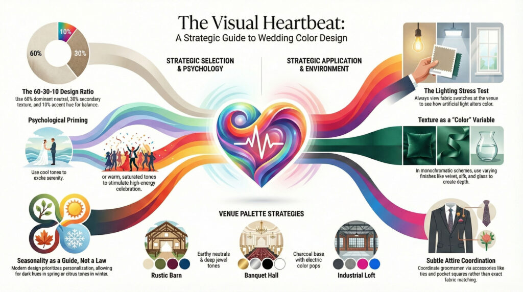
Lighting Matters: Overlooking Lighting Conditions is a Common Mistake
Lighting is the invisible hand that shapes color perception. A swatch that looks like a soft sage green in a store might look like a muddy grey under the dim chandeliers of a reception hall. Ignoring the lighting conditions of the venue is a frequent error that can lead to disappointing results on the wedding day. Understanding how light interacts with color is crucial for finalizing a palette.
Natural light is the gold standard for color accuracy. It provides a full spectrum of light that allows colors to appear true to their hue. Venues with large windows or outdoor ceremonies allow for a wider range of color possibilities. Pastels and soft metallics thrive in natural light. They reflect the sun and create a delicate ethereal vibe. However it is important to consider the time of day. The golden hour just before sunset casts a warm amber glow. This can make cool colors look warmer and richer. A midday ceremony offers bright blue white light which makes colors look crisp and vibrant.
Quick Answer
Always view your fabric swatches and paint chips under the specific lighting conditions of your venue. Ask the venue coordinator for a tour at the same time of day as your event to see exactly how the light hits the room.
Artificial lighting poses a greater challenge. Many banquet halls utilize tungsten or incandescent lighting. These bulbs emit a warm yellow or orange light. This warm light can drastically alter the appearance of colors. White linens may appear yellow or cream. Blue accents can look teal or green. Purple can turn into a muddy brown. To combat this couples can either adjust their palette or adjust the lighting. If the venue has warm lighting opting for warmer tones like peach cream or gold will look seamless. Trying to force a cool blue or icy silver palette into a room with warm lighting will result in a dull or dirty appearance.
LED lighting has become increasingly popular in modern venues. These lights are often tunable meaning the temperature can be adjusted from warm to cool. This offers a distinct advantage. Couples can request a cooler daylight temperature which makes whites pop and colors look fresh. However some older LED systems can cast a green or magenta tint on skin tones. It is vital to ask about the age and quality of the lighting system during the site visit.
Uplighting is another tool that can transform a space. Uplights are placed on the floor and shine up the walls washing the room in color. This is a powerful way to tie a palette together. If the walls of the venue are an unattractive color uplighting can wash them out with a neutral tone. Alternatively using the wedding colors for the uplighting can reinforce the theme. For example a wedding with a navy and gold palette might use blue uplighting to give the entire room a romantic midnight glow. When planning uplighting ensure the color of the light matches the decor. A clash between the uplight color and the linen color will create visual discord.
Key Takeaway
Lighting changes everything. A color that looks perfect in a design studio might look terrible in your venue. Never sign off on a palette without seeing the fabrics and samples in the actual space under the actual lights.
Application Details: Invitations Napkins and Seating Charts
Once the main palette is established the focus shifts to the details. These smaller elements are where the color palette truly comes to life. They provide the consistency that ties the event together from the moment a guest receives the mail to the moment they find their seat at the reception. Strategic use of color on paper goods and linens adds a layer of sophistication and polish.
Wedding invitations are the first glimpse guests have into the wedding aesthetic. They set the expectation for the formality and theme of the day. If the wedding features a navy and blush palette the invitations should reflect that. Using navy ink on cream paper or a blush envelope liner immediately establishes the visual language. It is important to maintain contrast for readability. Light text on a light background can be difficult to read especially for older guests. Ensure the text color stands out sharply against the paper color.
DIY printables offer a fantastic way to control the color palette precisely. Couples can print their own menus place cards and thank you notes using the exact pantone colors they have chosen. This ensures a perfect match across all paper elements. For those looking for inspiration or specific templates there are resources available online.
Napkins are a subtle but effective way to incorporate color. A standard white tablecloth acts as a base but colored napkins add a pop of personality. This is an excellent place to introduce a secondary color from the palette. If the primary color is emerald green the napkins could be a deep gold or a dusty rose. This creates dimension without overwhelming the table.
Attire: The Groom and Groomsmen: Incorporating Color Without Overdoing It
Selecting the right attire for the groom and groomsmen requires a balance between personal style and the overall wedding aesthetic. The days when every male member of the wedding party simply wore a standard black tuxedo are fading. Modern grooms have the freedom to express themselves through color. However navigating this freedom without creating a visual clash is essential. The goal is to look sophisticated and coordinated rather than like a group of mismatched characters. Achieving this look relies on understanding color theory and applying specific style rules.
The suit itself serves as the canvas. A navy or charcoal suit is a versatile choice that pairs well with almost any accent color. When introducing color into the male attire it is best to focus on accessories. The tie bow tie pocket square and boutonniere are the primary vehicles for color. These elements allow for pops of the wedding palette without overwhelming the eye. For example a deep burgundy tie looks striking against a charcoal grey suit. It adds richness without dominating the photograph.
It is important to consider the fabric and texture as much as the hue. A silk tie reflects light and offers a shiny finish whereas a knit tie provides a matte texture and a more casual vibe. Mixing textures can add depth to the look. A velvet bow tie in a deep emerald green can elevate a standard black suit to something luxurious and seasonally appropriate for fall or winter. The choice of fabric should complement the formality of the event. A beach wedding might call for linen pocket squares in soft pastel shades while a ballroom affair demands silk satins in richer jewel tones.
Matching the groomsmen to the groom involves a subtle hierarchy. The groom should stand out slightly from his groomsmen. This does not mean he needs to wear a completely different color. Small variations work best. The groom might wear a tie in the primary wedding color while his groomsmen wear ties in a lighter shade or a complementary neutral. Alternatively the groom could wear a pocket square that features a bold pattern while the groomsmen wear solid colors. Another strategy is the vest or waistcoat. If the groomsmen are not wearing jackets the groom can distinguish himself with a vest that matches the bridesmaid dresses or the wedding theme.
Pros
- Creates a cohesive visual story in photography
- Allows for personal expression within a traditional framework
- Adds visual interest and depth to the wedding party
Cons
- Risk of clashing if fabric swatches are not compared in person
- Can look dated if specific trendy colors are chosen
- Difficulty finding exact matches between different dress brands and tie manufacturers
Shoes and socks are often overlooked opportunities for color. Socks in particular are a fun way to inject personality. They are usually hidden during the ceremony but visible during seated photos and dancing. Socks featuring a geometric pattern or a solid pop of color that matches the wedding palette are a great touch. Shoes should generally remain neutral unless the wedding style is very specific. Brown tan or black leather shoes are the safest bet. Colored suede shoes can work for rustic or outdoor settings but they must match the rest of the outfit carefully to avoid looking like a costume.
The boutonniere is the final piece of the puzzle. It connects the groom to the bridal bouquet. If the bouquet includes white roses and eucalyptus the boutonniere should reflect that. Using a different flower for the groom can help him stand out. A larger bloom or a different type of greenery can distinguish the groom from the groomsmen. It is recommended to consult with a florist about which flowers will hold up well throughout the day and look good against the suit lapel. Some delicate flowers may wilt quickly in the heat while sturdier blooms like roses or ranunculus maintain their shape.
Lighting plays a massive role in how color appears. Indoor lighting with warm bulbs can make blue tones look grey. Natural outdoor light can wash out lighter colors. It is crucial to view the chosen accessories in a setting similar to the wedding venue. Taking a photo of the tie and pocket square next to the bridesmaid dress fabric in natural light is a necessary step. This prevents the disappointment of colors that looked perfect in the store but look mismatched in the wedding photos.
Key Takeaway
Use the suit as a neutral canvas and restrict the main wedding colors to accessories like ties pocket squares and boutonnieres. This ensures a sophisticated look that coordinates with the bride and bridesmaids without appearing overdone or costume like.
Step by Step Guide: Finalizing Your Perfect Palette
Finalizing a wedding color palette is one of the most creative yet daunting tasks in the planning process. The colors chosen will set the tone for the entire event. They influence the stationery the flowers the linens and even the lighting. A well chosen palette feels effortless. A poorly chosen one can feel disjointed and distracting. Following a structured approach to finalizing the palette ensures that the result is harmonious and personal.
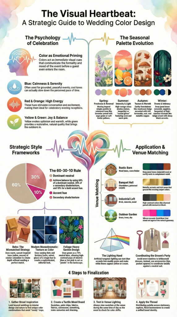
Start with Inspiration: Using Pinterest and Mood Boards
The journey begins with gathering inspiration. This is the time to explore every possibility without judgment. Pinterest is an invaluable tool for this phase. It allows users to save thousands of images and organize them into specific categories. A bride or groom might create boards for flowers attire table settings and bouquets. As these boards fill up patterns will naturally emerge. It is common to find that certain colors keep appearing over and over again. This is usually a strong indicator of a true preference rather than a passing trend.
Mood boards take this a step further. A mood board is a curated collection of images textures and colors that represent the overall feel of the wedding. Digital tools like Canva make creating mood boards easy. However a physical board using fabric swatches paint chips and magazine cutouts can be even more effective. Tactile elements help to visualize how the colors will interact in a three dimensional space. A flat image on a screen cannot convey the weight of a velvet tablecloth or the sheen of a silk ribbon.
When gathering inspiration it is helpful to look outside of wedding specific content. Interior design fashion and nature are excellent sources of color theory. A piece of abstract art or a landscape photograph can provide a unique color combination that feels fresh and sophisticated. For example a desert landscape might inspire a palette of terracotta sage green sand and dusty blue. This approach prevents the wedding from looking like a generic copy of every other wedding seen on social media.
It is important to identify the core feeling of the day. Is the goal to be romantic and moody? Or bright and energetic? Darker colors like navy plum and charcoal create a sense of drama and intimacy. Lighter colors like blush lavender and champagne feel airy and whimsical. The mood board should reflect this emotional tone. Including non color images on the board is also useful. Images of lighting styles such as candlelight or fairy lights can influence how the actual colors are perceived.
Test Your Combo: Ordering Swatches and Samples
Never rely solely on what you see on a screen. Colors render differently on every monitor and phone. Before finalizing your decision, order physical fabric swatches for bridesmaid dresses and linens. Bring these swatches to your venue and look at them in natural daylight and under the artificial lighting of the reception hall. Seeing the textures and true colors in person can save you from costly mismatches later.
Trust Your Instincts: Avoiding “Too Trendy” Traps
While it is helpful to know what is trending, your wedding photos should stand the test of time. If a popular color (“Butter Yellow” or “Brat Green”) doesn’t resonate with your personal style, skip it. The most beautiful weddings are the ones that feel authentic to the couple. If you love neutrals, embrace them. If you live for color, go bold. Trust your gut feeling over the current algorithms.
Conclusion: Crafting a Palette That Tells Your Story
Your wedding color palette is more than just a decor decision; it is the backdrop to one of the most significant days of your life. It sets the mood, guides your vendors, and creates a cohesive experience for your guests. Whether you choose the quiet elegance of neutrals, the drama of jewel tones, or the joy of a summer sunset, the most important rule is that it reflects who you are. By considering the season, the venue, and the psychology of color, you can craft a visual story that is not only beautiful today but will be cherished in your memories for decades to come.
FAQs
What is the 60-30-10 rule in wedding design
The 60-30-10 rule is a classic interior design ratio applied to wedding aesthetics. Sixty percent of the design should be a dominant neutral color, thirty percent a secondary texture or shade, and ten percent an accent hue. This balance creates a cohesive and visually pleasing atmosphere.
Can you have too many colors in a wedding palette
Yes, using too many colors can make a wedding feel chaotic and disjointed. Professional stylists typically recommend limiting the palette to three or four distinct colors to maintain a unified look. Focusing on a few shades ensures the decor appears elegant rather than cluttered.
Is it rude to dictate the color guests wear to a wedding
Yes, enforcing a strict color code for guests is generally considered rude by modern etiquette standards. Couples may suggest a color family or mood on their wedding website, but demanding specific outfits is improper. Guests should feel comfortable and free to express their personal style.
What colors look bad in wedding photography
Colors that clash with skin tones, such as neon greens or heavy fluorescent oranges, often look unflattering. Deep, saturated reds or blues can also cast strange color casts onto faces in photos. Sticking to soft, natural, or pastel tones usually yields the best photographic results.
What are the best wedding color palettes for a barn venue
Barn venues pair best with earthy, rustic palettes featuring sage green, dusty blue, and warm neutrals. These organic tones complement the natural wood and outdoor surroundings typical of barn settings. Adding textures like burlap or linen enhances the rustic charm without overpowering the space.
Do groomsmen ties need to match bridesmaid dresses exactly
No, groomsmen ties do not need to match bridesmaid dresses exactly but should coordinate tonally. Choosing a tie color that is a darker shade or a complementary pattern creates visual harmony. This approach looks more sophisticated than an exact match while maintaining a cohesive bridal party look.
Does the bride’s dress color have to be part of the palette
No, the bride’s dress does not need to be included as a primary color in the palette. Since most brides wear white or ivory, which are neutrals, they do not impact the color scheme. The palette should focus on the decor, floral, and accent colors.
What are the downsides of using neon colors for a wedding
Neon colors can wash out skin tones and create harsh reflections in flash photography. They are also notoriously difficult to source for natural elements like flowers and linens. Additionally, neons may distract from the romantic atmosphere, making the event feel more like a party than a celebration.
How do wedding color palettes differ between seasons
Wedding palettes reflect seasonal changes by utilizing colors found in nature during that time. Spring and summer weddings often feature bright pastels and vibrant hues, while fall and winter palettes favor deep, rich jewel tones. This seasonal alignment ensures the event feels harmonious with its environment.